


brand identity
Make it a good start
A fresh start to begin every morning.
Warm memories which we experience for the first time in life.
Always there with you to make every morning a good start.

Our Wordmark
As shaving experts, we understand our customers. Our logo includes the letter 'R' designed to mirror the shape of a person. The bold typeface represents our expertise and reliability based on our technology. The round, unique typography illustrates our friendly and approachable personality.
Clear space
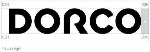
Clear space is a rule regulation to secure a minimal space toprevent the wordmark from being intruded by other elements.
The History of our Corporate Identity
-
1960's
Hanil Industrial, which produced knives and zippers was the predecessor of DORCO. In 1960, we changed our mission to developing and producing the best razors.
-
1990's
As South Korea's No. 1 razor company, we changed our name to DORCO to strengthen the brand image.
-
2000's
We announced the launch of the new logo as part of the ongoing evolution of R&D and further expansion of global reach.
-
2010's

We announced the launch of the new logo that conveys our mission in 2011. We have added a symbol to represent our initial D and the red color to reflect passion, energy, and confidence. The sharp arrow within the symbol symbolizes the bright future.
-
2019

We refreshed our logo in 2019, displaying our differentiated identity with a modern look while maintaining tradition and expertise in a rapidly changing environment.