brand identity
Elevate Every Moment
DORCO aims not only to create good products,
but also to bring happiness and satisfaction to your everyday life.
Always there for you, elevating your every moment.

Our Wordmark

The long, horizontal shape represents DORCO razors and the blade that edges closer and closer towards perfection. While the letters’ thick lines express our corporate scale, and their sharp edges indicate our 70 years of expertise in cutting edge technology.
Clear space
Clear space is a rule regulation to secure a minimal space to prevent the wordmark from being intruded by other elements.
The History of our Corporate Identity
-
1960's
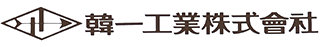
Hanil Industrial, which produced knives and zippers was the predecessor of DORCO. In 1960, we changed our mission to developing and producing the best razors.
-
1990's
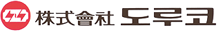
As South Korea's No. 1 razor company, we changed our name to DORCO to strengthen the brand image.
-
2000's
We announced the launch of the new logo as part of the ongoing evolution of R&D and further expansion of global reach.
-
2010's

We announced the launch of the new logo that conveys our mission in 2011. We have added a symbol to represent our initial D and the red color to reflect passion, energy, and confidence. The sharp arrow within the symbol symbolizes the bright future.
-
2019

We refreshed our logo in 2019, displaying our differentiated identity with a modern look while maintaining tradition and expertise in a rapidly changing environment.
-
2025

Our redesigned brand identity is crafted to convey a bold new attitude and signify DORCO’s journey to becoming a leading razor company of 70 years of expertise in cutting edge technology.